Star India — CLEAR™, a media ERP solution
This was a big one by PFT — transitioning STAR TV’s content management to the cloud. The PFT team successfully deployed the world’s first integrated, multi-platform content operation infrastructure specifically meant for broadcasters, a file-based solution built on their award-winning CLEAR™ Media ERP platform. Over a span of 5 years, I helped PFT conceptualise and design multiple cutting edge product interfaces for Star.
Content Live
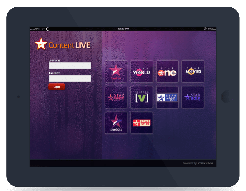
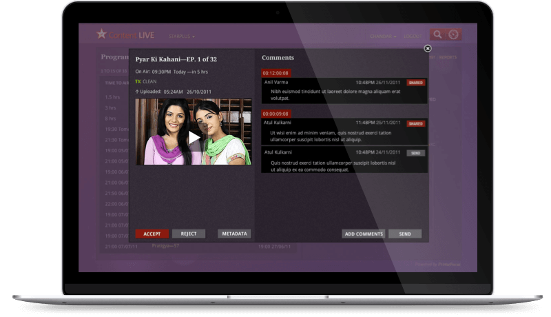
A pioneering concept, Content Live is an online storage platform to access, view and review shows, promos & commercials. Since we had no equivalent product to pitch ourselves against, we began work from scratch. I first developed the user experience for a browser based interface. Then, based on its huge success, I designed an iPad interface that soon became the go-to tool for all programme managers within Star.
Star Sports — Story Teller
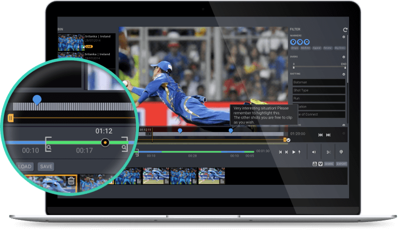
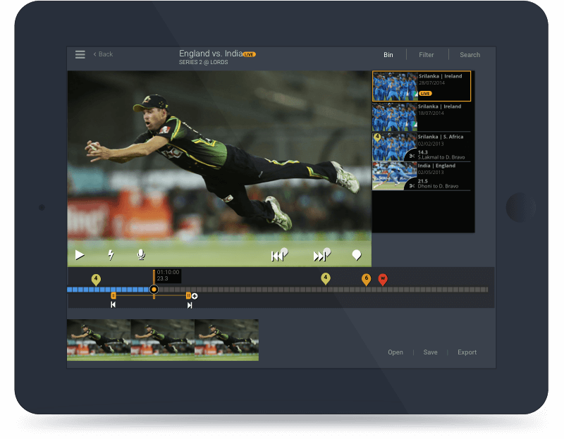
Soon after, the Star Sports team needed a tool to quickly mash-up live streams and create short story snippets for their web portal. This had an accompanying video player with advanced features like overlaid milestones and commentary, that are specifically required for sports. Again, we developed separate versions for both the browser and the iPad.
Star TV — Production Live
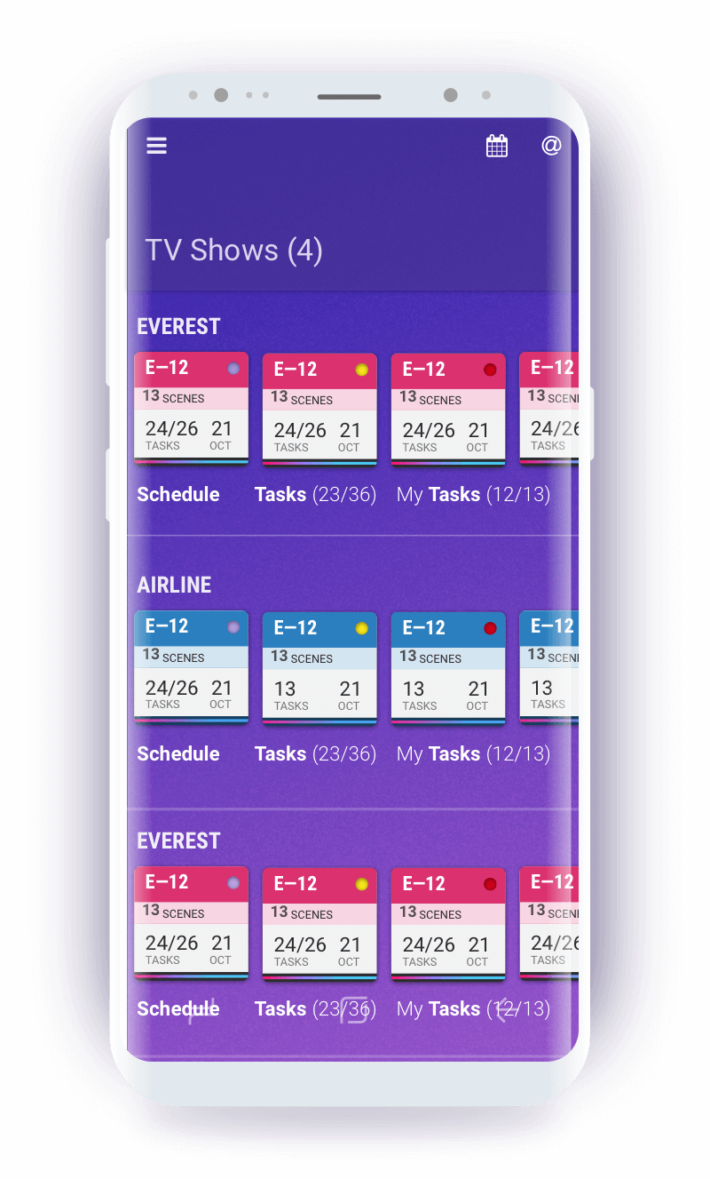
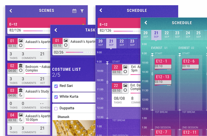
A conceptual exploration to see if we could bring together script writers, directors and production managers to one platform, this interface was designed to meet day to day requirements. Scripting, breakdown, scheduling and production all on a single mobile interface. Ease of use and quick interactions were the primary criteria for this user experience.
Cricket — Live Tagging
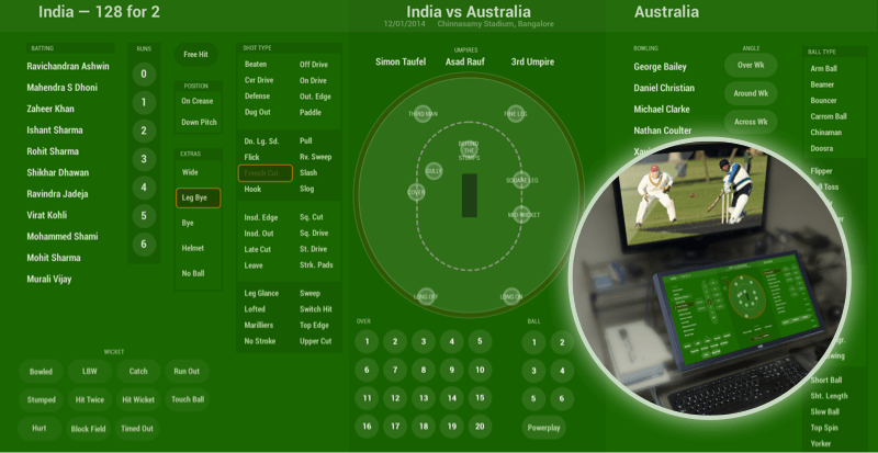
During a cricket match, all the key meta data associated with the game is captured on a ball by ball basis. It can be quite an intense activity, requiring both man power and training. This innovative interface was designed for a touch screen and tailored for the complex data model requirements of each match. Users could capture all the relevant data within just a few seconds, in the time taken between one ball and the next.
Star Sports — Mobile App
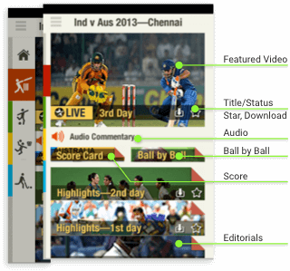
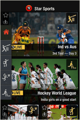
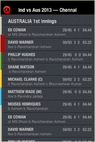
Quite a while before they launched HotStar, Star began to experiment with a mobile based user experience for sports content. My design criteria was clarity of presentation, with a focus on live stream, audio commentary and highlights. Since most sports fans pledge their loyalty to one sport, we created clear verticals and moved the navigation to an easy access swipe panel.
